Welcome back to the Indispensable Azure Tools series! So far, we’ve tackled tools that solve specific pain points in Azure management: Azure Monitor Baseline Alerts (AMBA) for proactive monitoring and the Azure Naming Tool for consistent resource naming. Today, our attentions shifts to a tool that gives you a bird’s-eye view of Azure’s evolving landscape; Azure Charts. If you’re a DevOps engineer, a Cloud architect, or an Azure Architect, this unofficial visualization tool is going to help you in your daily cloud journey.
What, Azure Charts?
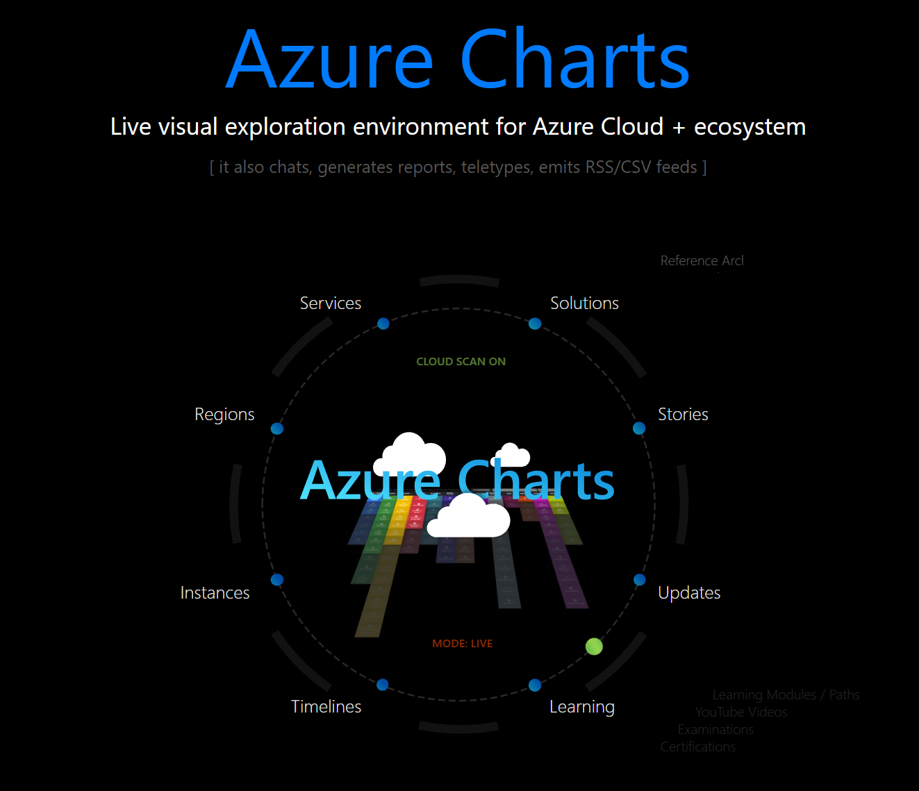
Azure Charts isn’t an official Microsoft product but a project by Alexey Polkovnikov, a Senior Cloud Solutions Architect at Microsoft. It’s a live, interactive visual guide that aggregates Azure updates, service lifecycles, SLAs, and more into simple charts. Its a a dynamic dashboard that connects the dots across Azure’s ecosystem.
Azure Charts is indispensable due to its visibility and context. For example when you’re tracking the latest service updates, planning for deprecated features, or checking SLAs, this tool delivers it in a visually attractive and intuitive format.
The Heatmap, aka what’s hot in Azure
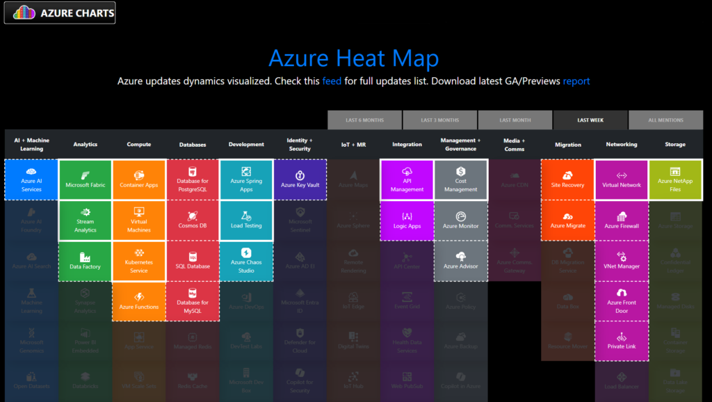
The Azure Charts Heatmap is where the action happens. It’s a color-coded grid showing which Azure services have received updates over the past week (or your chosen timeframe). The brighter the tile, the more recent or frequent the updates. Hover over a tile, and you’ll get a quick summary; click it, and you’re whisked away to the full update details.
Why is this indispensable? Imagine you’re preparing a team briefing or assessing whether a service you rely on—like Azure Functions or Cosmos DB—has new features or fixes. The Heatmap cuts through the noise, highlighting what’s “hot” in Azure. Pair this with AMBA (from our earlier post), and you’ve got a killer combo: proactive monitoring for your resources and real-time awareness of platform changes.

Pro Tip: Use the “Last 24/48 hours” filter to spot breaking changes or urgent updates that might impact your deployments.
The Lifecycle Page
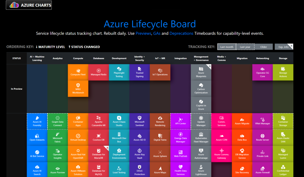
Next up is the Lifecycle page, a must-visit for anyone managing long-term Azure projects. This section tracks services and features that are retiring, in preview, or reaching general availability (GA). It’s your early warning system for deprecated APIs, SDKs, or entire services—think of it as a crystal ball for avoiding technical debt.
For example, if you’re using an older version of an Azure service, the Lifecycle page flags when support ends, giving you time to migrate. This ties back to our SLA blog, where we emphasized how service retirements can affect your uptime guarantees. With Azure Charts, you’re not just reacting—you’re planning.
Practical Use: Filter by “Retirement” to see what’s on the chopping block, then cross-check with your resource inventory (named consistently, thanks to the Azure Naming Tool) to prioritize upgrades.
Service lifecycle shows in Preview, General Availability and Deprecations

The SLA Overview
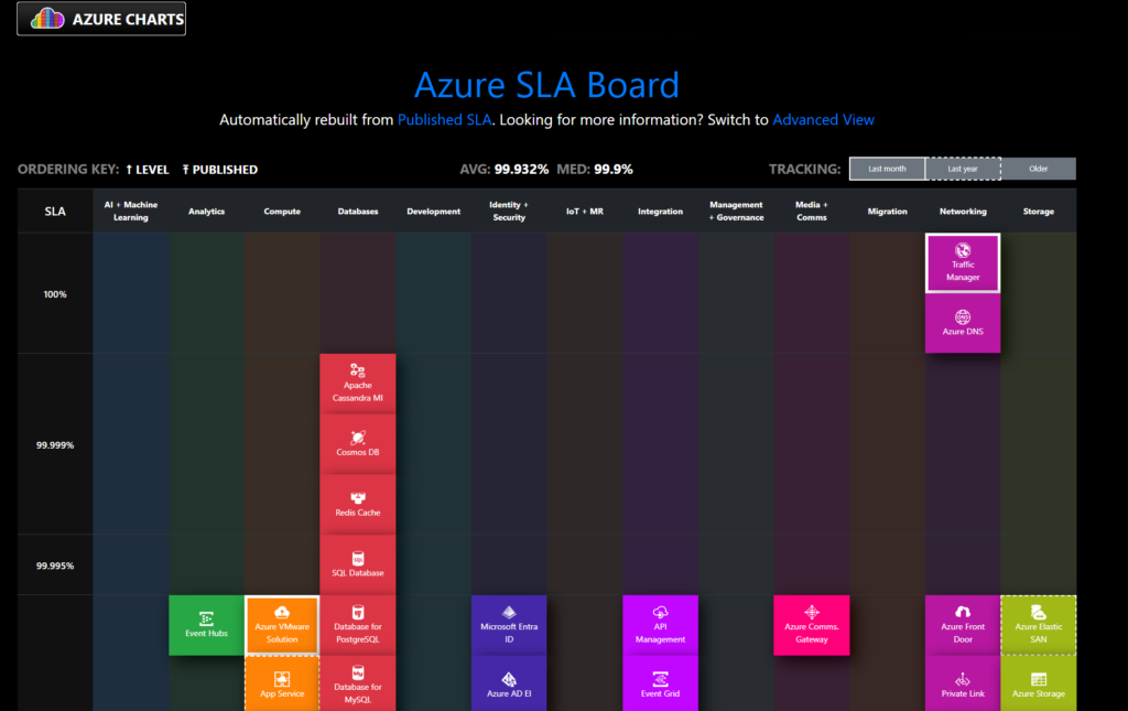
Finally, the SLA page is a one-stop shop for understanding Azure’s service-level agreements. It lists every service’s uptime commitment—e.g., 99.9% for Azure Virtual Machines or 99.99% for Azure SQL Database—linking directly to official SLA docs. This is gold for architects designing highly available systems or managers justifying Azure to stakeholders.
In our SLA blog, we broke down how SLAs translate to downtime tolerance. Azure Charts complements that by making SLA data accessible and actionable. Need to compare SLAs across services for a hybrid solution? This page has you covered.

Quick Win: Sort by SLA percentage to identify services with the highest reliability for your critical workloads.
Azure Charts belongs in your bookmarks
Azure Charts isn’t just a pretty map, it can help you in your day to day Azure life by:
- Saving time: No more digging through Azure Updates or Twitter for the latest news—it’s all here, visualized.
- Providing strategic insight: The Heatmap and Lifecycle pages keep you ahead of changes, while the SLA overview informs your architecture decisions.
- Offer role-specific views: Filter by job roles (e.g., developer, architect) to see updates relevant to you
And best of all; it’s a community-driven tool.
Getting Started
Head to azurecharts.com and start exploring the wealth of the available maps. Azure Charts ties together the themes of our Indispensable Azure Tools series, proactive management (like AMBA), consistency (like the Azure Naming Tool), and now, strategic awareness. It’s what keeps you informed in a cloud platform that’s constantly shifting.
Stay tuned as we roll out more indispensable tools to power up your Azure cloud journey!
